Case Study
Content Architecture Design
Problem
Our biometrics data is extremely complex and often hard to understand. How can we make it simple and meaningful? How can we present data to users in a glanceable and insightful way?
Athletes love our product because it gives them performance stats that no other device can. Our users love to see the grit of their details. But digging into the details can also easily cause confusion. Users are confused about what their data means and how to make it actionable.
Hypothesis
If we pair metrics with short, simple feedback phrases in a conversational tone, our users will understand the meaning behind their numbers. We’ll ease the user’s burden of having to decipher meaning on their own.
We need to write UI content that quickly answers the users’ questions:
“So what?”
“Why should I care?”
“What should I do about it?”
My Role
As Senior Content Designer, my role was to understand what’s meaningful to users, define the content architecture, and write pithy feedback phrases in a consistent tone.
I worked closely with the Product Owner, Product Designer, and our team of physiologists to comb through and pare down thousands of permutations of backend data that triggered different feedback phrases.
Jump to the results.
What We Did
1) Work in Lo-Fi Wireframes
Together with the Product Designer, we started by drafting Lo-Fi Wireframes of key screens. For each screen, we asked ourselves, “What question is the user trying to answer at this screen?” and established the UX flow.
2) Understand the Backend
After getting a sense of the high-level content that we wanted to present, I worked with our team of physiologists to understand how we could use our existing data library to trigger the outputs that we needed for content. We combed through thousands of permutations of triggers and mapped relevant triggers to key screens.
We made generous cuts to content. Where we felt that the user feedback wouldn’t be insightful, we’d rather say nothing than put empty words on screen.
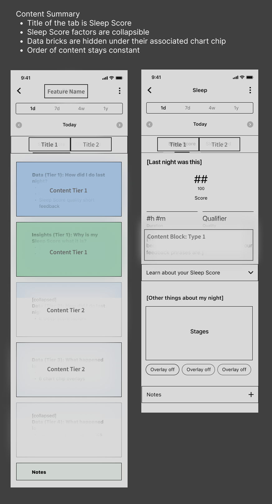
3) Establish Content Architecture
We had identified exactly what kind of content could be derived from our backend data, and we had done user testing to validate content hierarchy. Now we could confidently define the content architecture for the final UI.
4) Refine Copy
When the purpose and key pieces of content were clearly outlined, I could start to refine the specific UI copy.
It’s important to show that this step of meticulous writing doesn’t happen until late in the process. The hardest work is in creating purposeful lo-fi wireframes and outlining clear and simple content architecture. If that’s done well, the writing comes easy.
These are a couple of samples of how my lo-fidelity content design can look. I love to work in lo-fidelity. We save time and get much better results for it.


These are blacked-out sample of my annotations on the final content architecture. I like to make a clear map so the whole team is confident we’re on the same page. This way, developers can easily match logic to content.
Results
In user testing, our prototypes received some of the best test results that our research team has seen – in terms of usability and importance to our test users.
We ran A/B testing on near-final prototypes with a sample set of 8 users. It was clear through watching the videos that we had opportunities for improvement. But, overall, user testing was clear validation that our designs would be successful in the hands of our users.
Answers that we’ve found in this project are uncovering bigger opportunities across our platform.
As I’m writing this, we’re yet to release the feature to the public, (which is why you see black-out content on the designs above). So it’s impossible to know what the ultimate results of our designs will be.
However, we do already know that we’ve uncovered improvements that we’re going to be using across other features. We’ve carried out a process that has gotten us better design solutions than we’ve found before before. In that way, it’s already a success.